The logo and everything that follows is not just our face, but also represents our identity, our promise, and our connection with you. Podere La Gualda Vecchia was born in 2020, when on August 1st we took possession of the 3 sets of keys to the farmhouse. In these 3 years, the Podere has undergone a fascinating journey of change, transforming from an almost abandoned house into a family home, a hospitality business, a commercial activity, a public garden, and an event venue. The image change was a necessary step at this point.

The first logo of Gualda Vecchia, with soft colors, fluid gradients, and an aura of lightness, a beautiful watercolor created by Serena Capello, had a certain charm and a visceral connection with nature and the farmhouse. This brand captured the attention of an audience seeking authentic experiences. Gualda Vecchia was then the renovated farmhouse, immersed in nature. There was no Garden, nor the idea of a Garden! There were no events, no jewelry made with our flowers; everything was still "in potential."
The Transition to Refined Elegance: The New Logo
We had to find a solution that would bring together the 4 branches of La Gualda Vecchia: hospitality (rooms), the garden (garden), events (events), and the shop (shop). Not only that, but the new image also had to reflect the spirit of La Gualda Vecchia, what we want to convey, what by its very nature is transmitted to anyone who visits this place. Obviously, we couldn't do this work alone, so we turned to the team at Fuoricentro Studio.
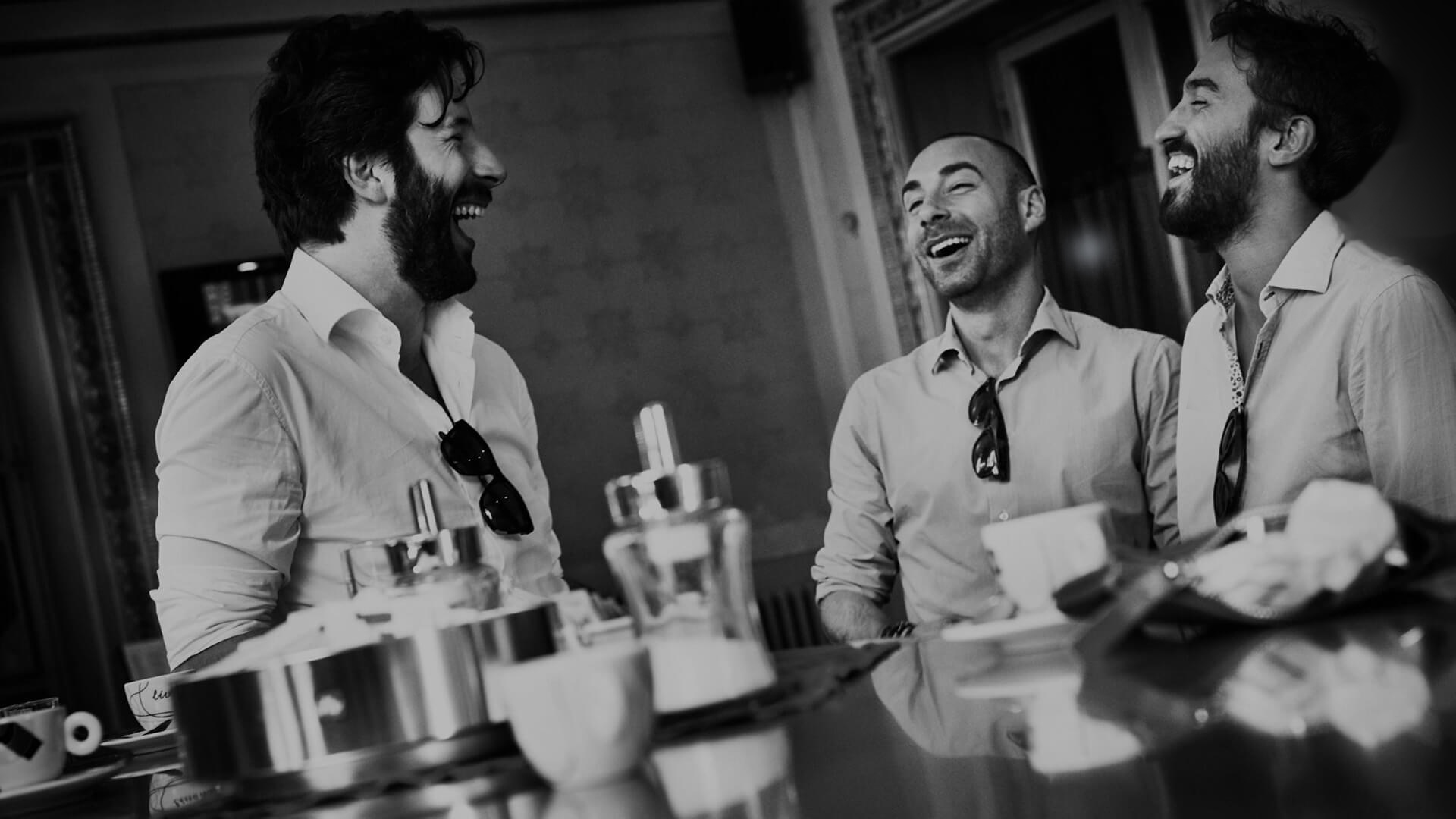
The Fuoricentro team has cross-disciplinary skills and a synergy built over more than 10 years of working together. I perceived all of this from our very first meeting. Authenticity, transparency, and empathy. They were the right people to entrust with this delicate task.
A New Beginning That Honors the Roots
The new logo needed to be concise, not too didactic, but in some way, it had to contain an element: the 3 red doors present in the labyrinthine flowerbeds of grasses. Our sculptural totems. The first impression one gets when visiting the Podere.
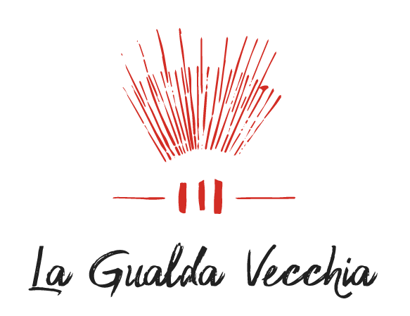
The final result is the synthesis of the Podere's many souls. A symbol capable of conveying the feeling of balance and the vibrations experienced during a stay at the structure.
Fuoricentro's preliminary research thoroughly analyzed the language of the esoteric world, seeking to create an intimate and contemporary symbol.
The base of the logo is solid, like our land, and at its center are the 3 red doors. From these red doors, two levels of rays emanate with different interpretations. My favorite is the iris; if imagination completes the circle of rays, one can glimpse an eye. An eye that in Gualda Vecchia first observes the external world and then, inevitably, shifts its gaze inward to the individual. The rays also recall the sun, energy. The energy centers created in the garden, revealed through the use of ancient geometries. The rays also resemble certain grasses and the details of some flowers.

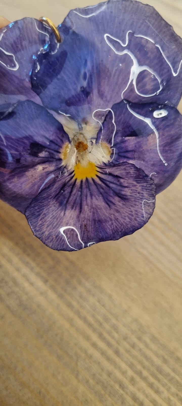
The solution to represent the 4 souls of Podere La Gualda Vecchia
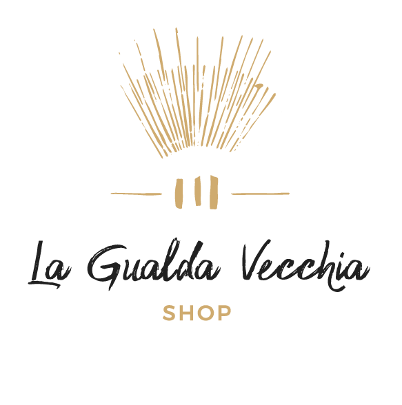
We have declined the 4 souls into 4 different colors, giving them a universal title in English. So we have:
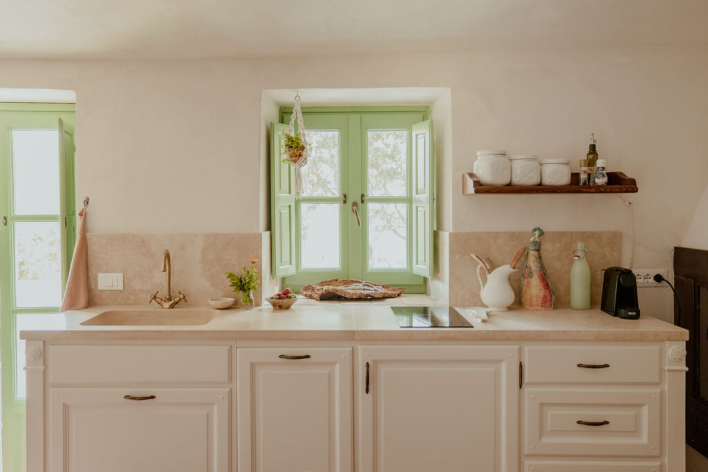
- Hospitality, which is green "Gualda Vecchia," like the farmhouse's fixtures
- The Garden, which is red, like the doors, the large bamboo canes, and other details to come 😉
- Events are a beautiful shade of purple full of vitality
- The Shop is a beautiful sand color, a natural element, just like the items sold in the shop
The celebration of the journey, of evolution
We have embraced change with a new visual identity, moving from the watercolor style to refined elegance. This transformation process has been a hymn to growth, adaptation, and evolution. While the watercolor logo may have been nostalgic and charming, the new logo represents modernity, quality, and sophistication.
This story of change reminds us that each phase of a company is a chapter in a long journey. And as in any journey, the important thing is to carry the best of the past with you while embracing the opportunities of the future. The new logo of the tourism company is a symbol of this new beginning, honoring its roots and opening the doors to a world of new adventures and possibilities.